CitiBank
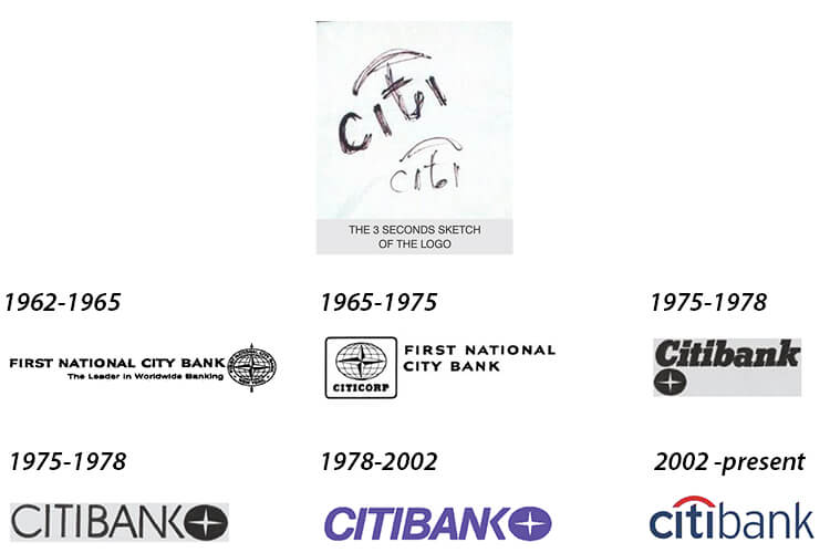
What started of a three seconds sketch is now the face of a multimillion bank. In 1998 Paula Scher had sketched the Citi Bank logo in a client meet. Citi Group changed their name to Citi when they needed a new corporate makeover. And today it proudly stands as one of the most recognised bank logos in the world. The red arch on Citi which encompasses the entire word makes for a beautiful and compact logo which has instant brand recall. The perfect arc over the letter ‘t’ embodies the traveller’s umbrella and the merger of the two companies brilliantly. The red colour in the logo symbolises passion, joy, acceptance and determination of the company, whereas the colour blue stands for excellence, elegance, approachability and dominance. Since its inception in the banking sector, CitiBank has played a vital role in the banking sector and the economy. From sponsoring the first jumbo jet of India to establishing currency administration assistance to banking and organisation and introducing India to the securitisation arrangement, CitiGroup has excelled in almost all their endeavours. According to Dr. Ravi Rao, blue is an appropriate colour for logos as they represent infinity, and more over it is very aesthetically pleasing to the eye. With the use of blue encompasses infinity in every form whether it is in the form of infinite possibilities or the subject of infinite growth. From a commercial angle as well, the use of the colours red and blue is ideal for such a brand and is probably the reason behind its worldwide success.