“Logos are not good or bad; rather, they are either lucky or unlucky.” – Dr. Ravi Rao
The logo represents the core values of the company. It is the visual identity of the company, which needs to be flawless for the smooth working and the success of the company. The colour of the logo stands for the life and health of a company and the shape influences the performance of the company. Inappropriate design, shape or colour can make a logo work against the company. Vaastu exerts its influence not just on the architectural structure of the company, but also on the logo of the company. A logo suiting the company will strengthen the company and lead it towards growth. A well designed, beautiful looking logo may not be right for your company. The logo has to be in tune with vaastu in order to bring favourable results. A good or a bad logo is determined by the flow of the positive or negative energy; in accordance with your business. According to Astro-Vaastu principles, altering or fine tuning the logo will swing the company’s fortunes for the better.
Dr. Rao renders expert advice on logo selection and creation, placement, logo analysis and modifications, using the precepts of Vaastu to align them with the company’s goals and business objectives. He strongly believes that the logo is closely related to the success of a company. Dr. Rao has transformed the fortunes of many a company, nationally and globally by modifying their logos.
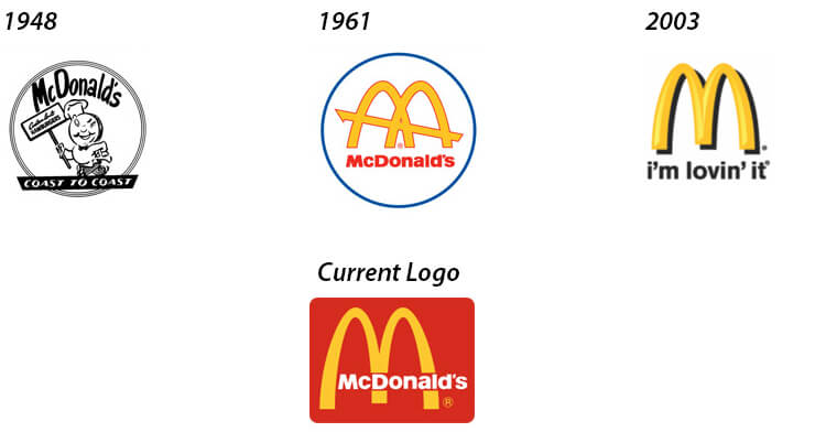
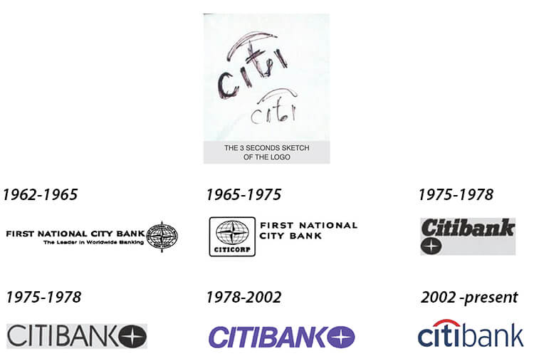
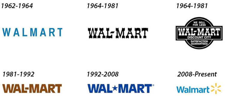
McDonald’s, Citibank and Walmart are few of the best logo stories which illustrates the relation between their growth & development and the evolution of their logos.

McDonalds
Colour plays a vital role in determining the strength and the vaastu significance of a company’s logo. According to Dr. Rao, food is governed by the planet Venus, where as any business or entrepreneur abilities are ruled by the planet Mars. Coincidentally both these planets are ruled by the colours yellow and red. Read More
[Wow-Modal-Windows id=1]

CitiBank
What started of a three seconds sketch is now the face of a multimillion bank. In 1998 Paula Scher had sketched the Citi Bank logo in a client meet. Citi Group changed their name to Citi when they needed a new corporate makeover. And today it proudly stands as one of the most recognised bank logos in the world. Read More
[Wow-Modal-Windows id=2]

Walmart
After Walmart was established in 1962 it did not have a set logo. It was blue in colour with no set font. However, they changed their logo after two years and on the year 1964, they had changed their logo to a bold Frontier font. They further changed the colour to black and separated Wal from Mart with a hyphen. Read More
[Wow-Modal-Windows id=3]
“The Logo is the soul of the business. Its shape and size determines its performance.” – Dr. Ravi Rao

